12 May 2017
Animate with Swagger (and Stagger)
- Vanilla JS
Animations make the web a far more interesting place. In this post, we’ll learn how to roll our own staggered list animation with Vanilla JS and CSS. No frameworks or plugins. 60 frames-per-second or bust!
Scenario
You’re building a health and fitness web application, and you’d like to enhance the UI by adding animation. You’ve designed a step-count leaderboard, but want each list item to fade in one after the other (staggering between each iteration).
Mockup
Rundown
Designing & Animating The Bars
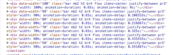
From a design perspective, we’re building a horizontal bar chart (sorted by longest to shortest). Each bar has a dynamic width, a fake name, and a fake step count. Instead of hard-coding each bar’s width as an inline style, we’ll assign a custom data-width attribute that can be read in our Javascript.
<div
    data-width="100"
    class="bar mb2 h2 br4 flex items-center justify-between pr3">
    <h1 class="name mv0 fw6 f7 white">
      <!-- Name to be set via Javascript -->
    </h1>
    <h2 class="steps mv0 fw4 f7 white-50">
      <!-- Steps to be set via Javascript -->
    </h2>
  </div>
Where the magic happens, though, is the CSS for our .bar class. We apply a gradient to make it look pretty, and add a keyframe animation that tweens the bar from zero to full opacity.
You’ll note that we’re omitting both the animation-duration and the animation-delay property from our CSS. In the next step, you’ll see how we can use Javascript to add these values dynamically and give our animation a wonderful “staggered” effect.
NB: You don’t need Javascript to achieve this effect. Sass / SCSS can help you get the same outcome
.bar {
  animation: grow-bar cubic-bezier(0.23, 1, 0.32, 1) forwards;
  background: linear-gradient(to left, #004e92, #000428);
  opacity: 0;
}

@keyframes grow-bar {
  0% {
    width: 0;
  }
  100% {
    transform: translateX(0);
    opacity: 1;
  }
}
In our Javascript, we’re iterating over the .bar elements on the page, and performing a few actions:
- Read the bar’s
data-widthattribute and set the element’s width accordingly - Set the bar’s
animation-durationto the variableBAR_ANIM_DURATION. By creating this variable, we can adjust the speed of our animation (for debugging/fine-tuning) by tweaking one variable. - Calculate and set a staggered animation-delay via some simple arithmetic
Note that with each iteration of the forEach, loop, the animation-delay property increases ever-so-slightly, giving us a staggered effect. If we had hard-coded a constant value in our loop, the bars would all fade in at the exact same time.
let bars = document.querySelectorAll('.bar')
const NUM_ELEMENTS = bars.length
const BAR_ANIM_DURATION = .65

bars.forEach((bar, index) => {
  // Read 'data-width' and set the bar's width
  bar.style.width = `${bar.getAttribute('data-width')}%`

  // Set 'animation-duration'
  bar.style.animationDuration = `${BAR_ANIM_DURATION}s`

  // Calculate Staggered Delay
  let barDelay = index * (BAR_ANIM_DURATION / NUM_ELEMENTS)

  // Set Staggered Delay
  bar.style.animationDelay = `${barDelay}s`
})
Animating The Names
We’ll take a similar approach to animate the names inside of each bar. In our CSS, let’s add another keyframe animation that tweens each name from zero to full opacity, and moves it to a neutral X position.
.name {
  animation: slide-name ease forwards;
  opacity: 0;
}

@keyframes slide-name {
  0% {
    transform: translateX(-25px);
  }

  100% {
    opacity: 1;
    transform: translateX(0px);
  }
}
As mentioned before, we can leverage our ability to work with fake data to assign a random name to each bar. Moreover, we can perform a similar calculation to stagger the animation of each name element.
// Animate names quicker than bars
const NAME_ANIM_DURATION = .25

bars.forEach((bar, index) => {
  let name = bar.querySelector('.name')

  // Assign a fake name
  name.innerText = faker.name.findName()

  // Set 'animation-duration'
  name.style.animationDuration = `${NAME_ANIM_DURATION}s`

  // Calculate Staggered Delay
  let barDelay = index * (BAR_ANIM_DURATION / NUM_ELEMENTS)
  let nameDelay = .15 + barDelay + (index * (NAME_ANIM_DURATION / NUM_ELEMENTS))

  // Set Staggered Delay
  name.style.animationDelay = `${nameDelay}s`
})
Animating The Step Counts
By now, you should be a pro at this. Let’s add another keyframe animation that tweens each step count from zero to full opacity, and scales it up from quarter to full size.
.steps {
  animation: grow-steps ease forwards;
  opacity: 0;
}

@keyframes grow-steps {
  0% {
    transform: scale(.25);
  }

  100% {
    opacity: 1;
    transform: scale(1);
  }
}
And in our Javascript, let’s perform that same calculation to create a staggered animation delay.
const STEPS_ANIM_DURATION = .25

bars.forEach((bar, index) => {
  let steps = bar.querySelector('.steps')

  // Add a bogus step count
  steps.innerText = (NUM_ELEMENTS - index) * 1000

  // Set 'animation-duration'
  steps.style.animationDuration = `${STEPS_ANIM_DURATION}s`

  // Calculate Staggered Delay
  let barDelay = index * (BAR_ANIM_DURATION / NUM_ELEMENTS)
  let nameDelay = .15 + barDelay + (index * (NAME_ANIM_DURATION / NUM_ELEMENTS))
  let stepsDelay = nameDelay + (index * (STEPS_ANIM_DURATION / NUM_ELEMENTS))

  // Set Staggered Delay
  steps.style.animationDelay = `${stepsDelay}s`
})
See the Pen QvrwPW by Matt Rothenberg (@mattrothenberg) on CodePen.